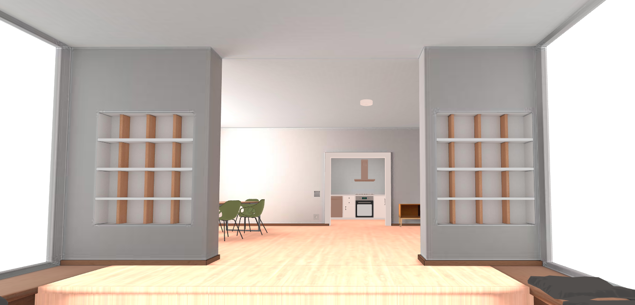
Modern

A very old project of mine, back then I worked as a trainee at “Des Wahnsinns Fette Beute”. Must have been around 2017. Some things I find really cool about the project:
- Lazyloading
All textures are first loaded as placeholders and then in high resolution. This means that the user has to load a little more data overall, but the website is interactive much faster.
- Die Controls
Three.js, the framework I used to implement the website, has a built-in OrbitControl class that you can use in most cases but unfortunately was not flexible enough for this use case. That’s why I implemented my own control class and I have to say I’m really happy with the usability.
- Die Settings
I think the settings animate beautifully and are nicely laid out. I especially like the quality slider with its quick feedback.
Not bad at all for such an old project, I don’t want to say anything about the code quality here. If you want to take a look at it yourself, here is the Link.